
Now over time mobile, tablets have become more prevalent which has increased the trend of responsive web design frameworks in web development. Due to the increasing use of these tools among people, the process of website development has also changed. Now it has become necessary for the website to be responsive on every device. Responsive means that the design in each device changes to suit the device. Your website should look perfect on every device. Responsive web design frameworks make this task much easier and cheaper. Most IT companies use responsive frameworks in web development projects .Creating a website from Sketch is more complex but using Responsive Framework enables us to create designs from Pre-built components. There are many responsive frameworks available in the market right now that you can use in your web development projects.
Responsive web design framework is software that combines HTML, CSS and JavaScript code to make web design easy. Responsive framework is essentially important in the stage to website design. The practice of using these frameworks is the most prevalent at the moment. It is more popular among designers and developers. It is much better than non-responsive framework and with this it helps in quick development of website design.
Right now there are many responsive frameworks available in the market, information about the best frameworks is being given here –

You can build responsive websites faster with Bootstrap. The world’s most popular responsive framework is Bootstrap. With Bootstrap you can quickly design and customize a responsive mobile first site. It has powerful JavaScript plugins with SCSS variables and mixing, responsive grid system, and prebuilt components and is also open source. Front end development is very easy to do with Bootstrap as it comes with a starter template and detailed guides. By which you can use these starter templates on your website. Booster 5, a new version of Bootstrap is available in the market which is based on the Flexbox property of CSS Bootstrap has a library of many SVG icons that you can use in your projects.

The most advanced & fast responsive front-end development framework in the world. It’s easy to create responsive designs much faster. It is easy to design websites, apps and emails by Foundation. It is Semantic Mobile First and Easy to Customize Professional Responsive Framework. Foundation 6 has changed the way we design and build web. It features the new XY Grid, navigation and menus, buttons, callouts, forms and rendered with Foundation’s JavaScript. One of the special features of Foundation is that it has many templates for websites, apps as well as email design. By this you can create responsive Emailer. The world’s top brands are using the foundation for their web projects.
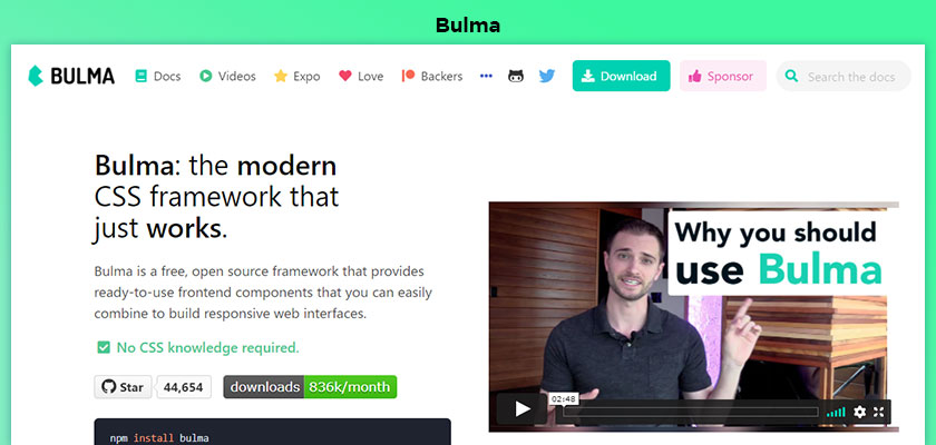
Bulma is a modern CSS framework that works only for the web frontend. It is a free, open source framework that provides you with easy-to-use frontend components to build web interfaces. Bulma is 100% responsive, modular, modern built with Flexbox and Open Source Framework. It is created by Simplest Grid System which uses CSS flexbox property. Through this you can create and prepare your designs in a few minutes. With this the SCSS variables are easily customized. Plus, no JavaScript is used in it, so it can be easily integrated with any front-end web development framework. Bulma is fast becoming a widely used responsive framework. It has 200,000 developers as its contributors.

PureCSS a set of small, responsive CSS modules that one can use in web projects. it is a tremendous option for getting web projects done very quickly. Pure CSS is a very small module set which is 3.7 KB in file size. The mobile, tablet has been designed keeping in mind the devices and its size has been kept small. Each row of its CSS is carefully considered and then minified. And you’ll save more bytes if you want to use one of its modules. Take a look at a few different layouts using grids, menus, etc. and start your next web project with a solid foundation. It’s easy to create beautiful responsive layouts for all screen sizes.
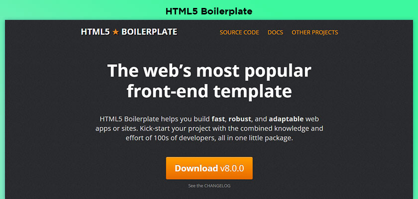
HTML5 Boilerplate is the web’s most popular front-end template responsive framework. It also helps you build a fast, robust and adaptable web app or site. With it you can kick-start your project in one small package with the combined knowledge and effort of the developers. With its help you can save web development time. It includes a lean HTML template that is mobile-friendly, customized Google Analytics snippets, placeholder touch-device icons, documentation covering Apache settings and dozens of additional tips to help you deliver excellent site performance. Microsoft, NASA, Nike, Barack Obama, ITV News, Creative Commons, Australia Post, and many other big names use it in their projects.

HTML KickStart is an ultra lean HTML5, CSS and JS framework for rapid website prototyping. It comes with a responsive, MIT open source designer friendly and presence of 400 plus icons. HTML KickStart Tested and working in IE 8+, Safari, Chrome, Firefox, Opera, Safari IOS, Browser and Chrome Android. It has many components like Button, Button Bar, List, List View, Menu, Tables, ToolTips, Typography, Horizontal Rules, Icons/Glyphs, Tabs, Breadcrumbs, Grid/Columns, Images Caption, Image Gallery, Slideshow Images, Form, Inline Form. It has over three million downloads. HTML Kick Start is also very easy to set up. You can use it by simply including 3 files in your project.
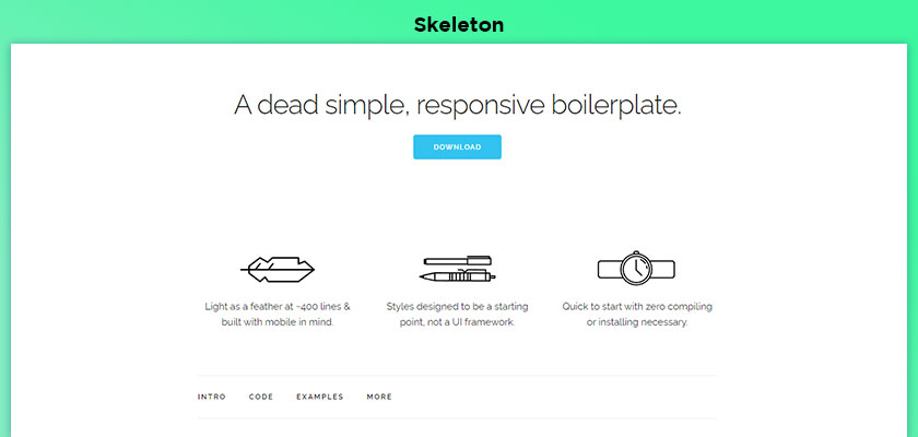
Skeleton is A dead simple, responsive boilerplate. Designed with light and mobile in mind as a wing on ~400 lines. It is designed as a starting point for styles, not a UI framework. Can install it quickly with score zero compiling. If you feel like you don’t need all the utility of a large framework and if you are starting a small project you can use Skeleton. It only styles a few HTML elements and includes a grid. Its syntax is simple and makes coding much easier. It has a 12 column fluid grid with a maximum width of 960 pixels that changes depending on the browser or device. To change the maximum width, if you change it with a single line of CSS, all the columns resize accordingly.

Semantic UI is a user interface language of the web, Semantic is a development framework that helps in building beautiful website layouts using HTML. It treats words and classes as interchangeable concepts. Classes use syntax from natural languages such as noun/modifier relationships, word order, and plurality to intuitively link concepts. It’s a fast growing framework which is more in vogue these days. With this you develop your UI once and then deploy the same code everywhere. It comes equipped with an intuitive legacy system and high level theming that gives you complete design freedom. Design variations built into Elements allow you to choose how materials adjust for multiple devices.
UI Kit is a lightweight and modular front-end framework for developing fast and powerful web interfaces. It’s gives you a comprehensive collection of HTML, CSS, and JS components which is simple to use, easy to customize and extendable. UI Kit passed the test that it works fine on all recent versions of Chrome, Firefox, Microsoft Edge, IE 11+, Safari 9.1 and Opera browsers. You can become a member of the UI Kit community by following on Twitter and contributing to GitHub.
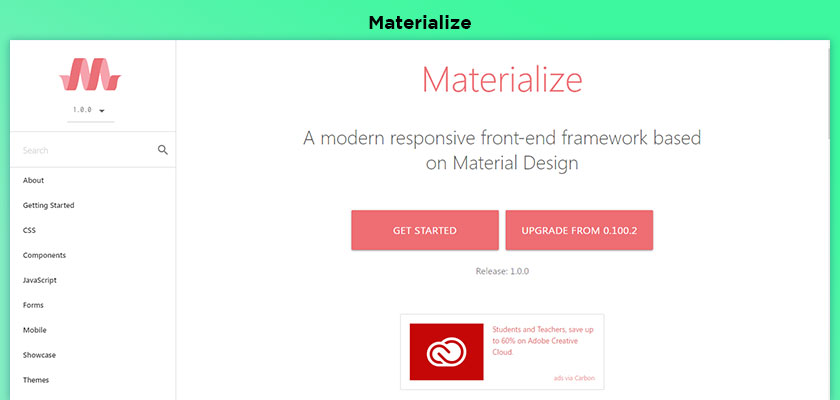
Materialize is a modern responsive front-end framework based on Material Design. This is the design language that Google created and designed. Which combines classic principles of design with technology. Google aims to develop a design mechanism that allows its users to have a uniform experience on any platform. The core principle of Material Design is based on paper and ink. Harnessed innovation to facilitate creativity. Elements and components such as grids, typography, colors and images create a sense of meaning and focus. Motions show a striking resemblance to what the user sees on screen and in real life. Motion has continuity in addition to giving users additional subconscious information about objects and changes.
As technology has expanded in this time, many devices like mobiles, tablets are becoming more popular among people, which has increased the use of responsive web design frameworks in web development. Along with the above mentioned frameworks, there are some other frameworks which are good and more useful like Montage, Siimple, Gumby, Cascade, Simple Grid, W3.CSS, SproutCore, Zebra, Less Framework, Milligram, Susy, Sencha Touch, Leaf, Essence, Baseguide. You need these above mentioned responsive frameworks to accomplish web development. You can select any of these as per your requirement and start web development. It is also important to note that some frameworks are only for beginners, highly experienced or skilled developers, so choose the type of framework with expertise.
We hope that we have been able to give you the correct information about Responsive Framework. If you are unable to select the framework for your new project then you can take advantage of our Front end development service and feel free to drop your queries and requirements on our Request a Quote.